Once Upon a Hive …
Updated logo reveals 100-year journey of the Sioux Honey Co-op

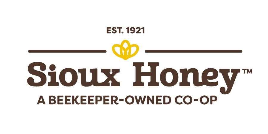
Tell a 100-year story in a single, unassuming logo. That was our ambitious goal when we set out to design the updated Sioux Honey Co-op logo – crafted, coincidentally, during our 100th anniversary.
What story does our refreshed logo tell? If you look closely, you can envision a story about five beekeepers from Sioux City, Iowa, who decided to pool their honey and create a partnership, a co-op, back in 1921. That’s a heritage reflected at the top of our updated logo.
Heritage is – and always will be – at the root of our beekeeper-owned co-op, which has grown from those five beekeepers to more than 200 Sioux Honey families today. It’s a legacy at the heart of our beloved co-op that highlights our generational commitment to quality, and celebrates our unique place in the honey industry.
Simply put, “We wanted to update our Sioux Honey logo to better reflect the heritage of our co-op members and honor the purity of the honey they produce,” says Alex Blumenthal, President & CEO of the Sioux Honey Co-op.
That purity comes from a logo that is purposely simple and free of clutter. We didn’t want to over-design it. Rather than feeling “trendy,” our hope was to not only shape a logo that represented a forward-moving co-op, but also one with a rich history.
Instead of sharp edges, we worked towards a more natural, fluid design to propel the oval-like rings that make up the icon.
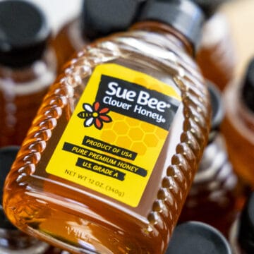
“The typography inspired by the SUE BEE® logo needed to reflect the consumer loyalty that SUE BEE® has earned over the past 100 years,” Blumenthal says.
The three ovals represent three unique aspects of Sioux Honey:
- One, they make the shape of the world’s most precious and essential pollinator, the remarkable, hard-working honeybee.
- Two, the interlocking of rings symbolizes the interconnectedness of our beekeeper-owned co-op members.
- And three, the ovals themselves pay homage to the oval shape that formed the background of one of our earlier logos.
Often, the absence of an element tells a story, too. Longtime Sioux Honey lovers might have noticed that the word “Association” has been removed from the end of our name. Today, we are simply the Sioux Honey Co-op.
“We decided to remove the word ‘Association,’ because we felt it didn’t accurately reflect the spirit of the nurturing and entrepreneurial nature of the hundreds of small, individual family-owned beekeeping businesses that joined together as a co-op to champion both the health of our bees and purity of their honey,” explains Blumenthal.
Conversely, we added a new element – the words “a beekeeper-owned co-op” to the base of the updated logo – to reflect our heritage even further.
And finally, the colors. We chose to use earth tones in our updated logo to tell another piece of the story. It shows that our beekeepers are stewards of the land, and our honey is natural, while the golden hue mimics both the coloration of the honeybee and the pure golden deliciousness of our honey.
How does this story end? The best part is that it doesn’t. Our story is a happily-ever-after affair, and we can’t wait to see what happens over our next 100 years.


